
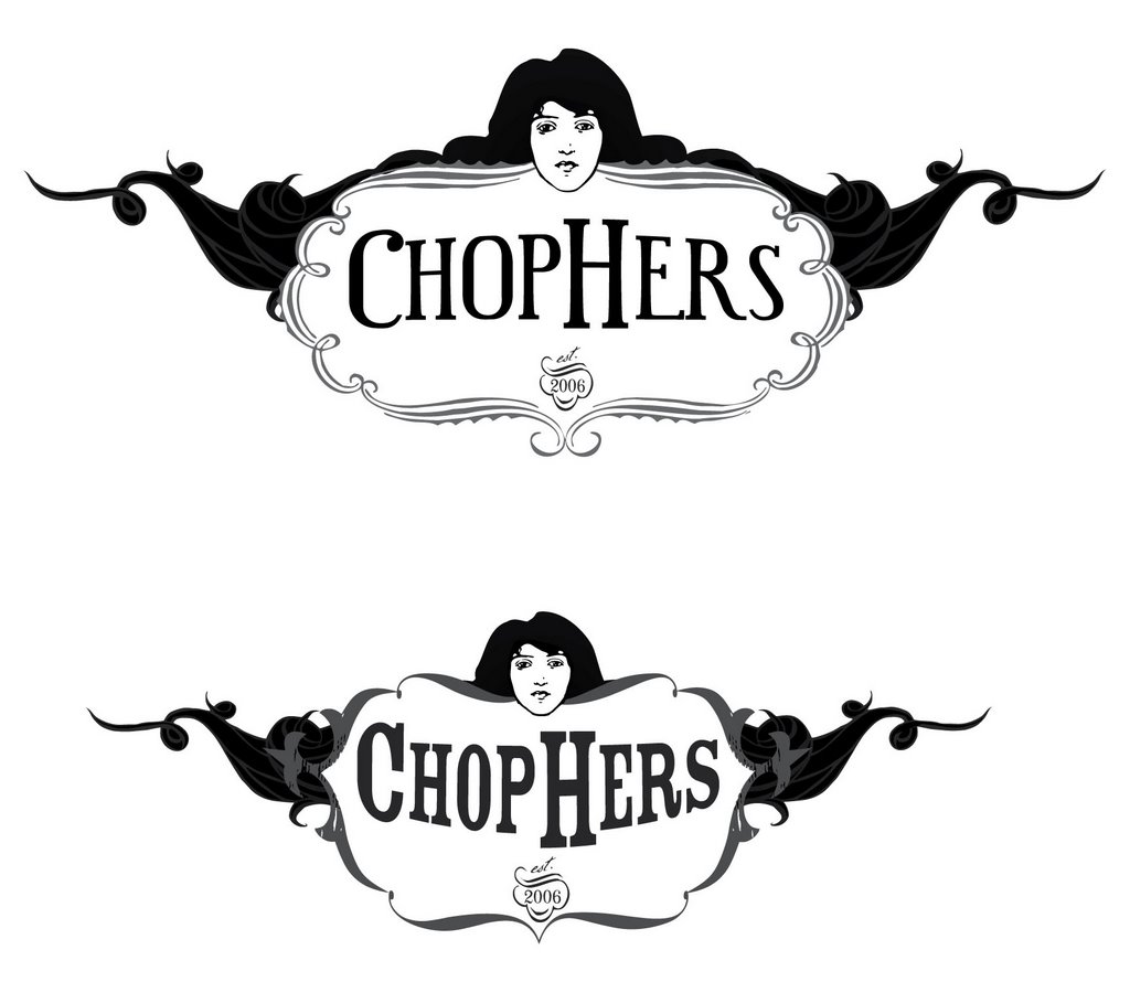
once in a blue moon i like to post my "in progress" works for some critiques. I don't know why but i've been getting logo work and it's not necessarily my specialty so i'm always a bit frazzled when it comes down to the nitty gritty elements. So this logo is for a new company which will manufacture custom motorcycles but the twist is that it's woman owned and operated! so i have this challenge of making a motorcycle logo with a feminine feel which will also have to not include T&A. The owner has this long beautiful black hair so we had the idea of incorporating it to accomidate that feminine touch. I'm thinking i like the set up but i think i might make some of the hair wrap and "hug" the frame a bit, like it's embrasing it. and i definately have to tweek the type, she likes the bottom logos type but i think it's a little much considering how she wants things spelled with small caps like that. let me know what you think? comments are what i need right now!
Hi!
ReplyDeleteCan I please preface what I'm about to write by saying that I don't know what I'm talking about, as in I'm not trained in graphic design. So disagree as you will!
I think I prefer the shape of the second logo, the way it dips in the middle, especially since you're extending and tapering the hair so horizontally. I might even push the bottom angles of the central shape a little more to make the whole thing more pleasing. I prefer the variety of line and line weight in the first logo. The second feels a little even. And I'm not nuts about the the amount and evenness of the white space under the text in both logos, especially the second.
This may be a silly thought, but perhaps you should check out some Mucha stuff.
Hope that helps!
The second logo is great!!!
ReplyDeleteThough I think it would be nice if the C and the H were the same size.
i agree with the C and the H, i hate them like that but my client wants them that way...sometimes you just have to bite the bullet i guess. thanks for your comments! i will take both into great consideration!
ReplyDelete