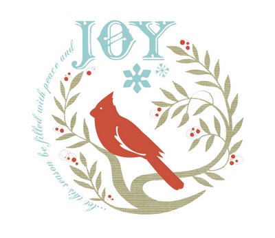
i thought i'd post my holiday card WIP because i'm so inspired by multiple elements of it this year. i decided to choose a cardinal as my reaccuring holiday theme this year becuase where i'm living right now seems like the breeding ground for some beautiful cardinals. they are so awsome to watch it's like these bold red mini rockets flying around everywhere and the contrast of them just makes them pop out from all the other birds that come to feed. i also wanted to play up some textures and type elements too, i'm still thinking about putting some kind of pattern or texture onto the cardinals body but i'm not quite sure yet. what do you think?

I love it just the way it is, but a reverse pattern maybe echoing the leaves and berries might be nice. It would have to be subtle so as to not take away from your already good design. Maybe the bird could be a tiny bit larger? Anyway, It looks great right now. Just found your blog through Creature Comforts and I'm really inspired by it.
ReplyDeleteoh, beautiful card!
ReplyDeletei like the size of the bird. my only comment is actually about the text. the circle seems a bit lopsided bc the "JOY" is slightly off-center and the text on the left *appears* to run outside the circumference of the circle (probably because the blue is lighter than the green on the right)..does that makes sense? is there a way to balance the circle a bit more?
anyway, i'm so happy i find your blog!
L
I like it! I love white! And I like that the elements are not centered!
ReplyDeleteHe is beautiful... i could see using a tonal pattern - maybe something swirly to echo the curving branches, but not something too busy cuz he is so cool... beautiful work!
ReplyDeletebeautiful composition. I love the colors too!
ReplyDeletethank you for your much needed critiques! i really apprechiate it. my favorite part of blogging is being able to talk to other creative minds about my work, when i actually get to post it! stay tuned for a photo of the finished product!
ReplyDeleteBeautiful .... just beautiful .... I think its finish :-)
ReplyDeletei really love it ...and look forward to seeing what else you do to it to make the finished design!
ReplyDeleteA beautiful card. I love the 'off centre' type!
ReplyDeletewow! thanks so much for all your great comments, looks like this is what i'm stickin with...i'll post the final product soon!
ReplyDelete